Documentation Index
Fetch the complete documentation index at: https://guide.cloud.blnkfinance.com/llms.txt
Use this file to discover all available pages before exploring further.
Overview
- What day of the week has the highest transaction volume?
- How much revenue is generated per currency?
- What is the total amount being held for customers today?
Alt + I for Windows).
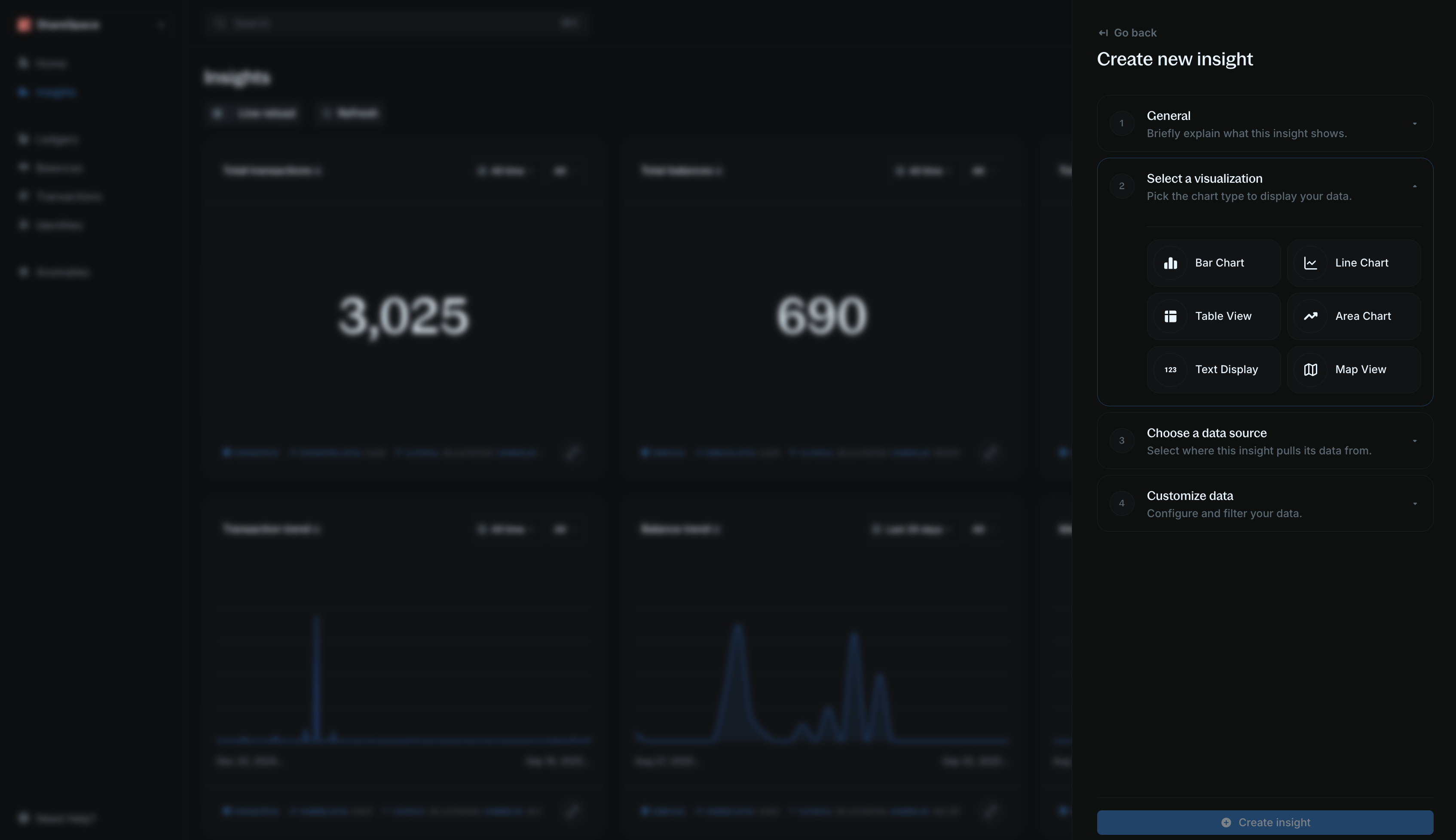
Step 1: General information
Start by giving your insight context:- Title — a short, clear name (e.g., “Monthly transaction volume”).
- Description (optional) — explain what this insight shows so others can understand its purpose.
Step 2: Select visualization
Choose how you want to display the data:- Bar chart, line chart, area chart for graphical representation.
- Table view or text display for showing raw numbers.
- Map view for location-based data.
Step 3: Choose a data source
Decide which dataset the insight will pull from:- Transactions — your transaction records and activities.
- Balances — balances in your ledger that hold value.
- Identities — individuals or organizations in your ledger.
- Alerts — events flagged by Blnk’s monitoring engine.
Step 4: Customize data
Refine the dataset to show only what you need:Data field
Select the field you want to analyze. This determines the specific question your insight will answer.For example: You want to know the total transaction amount deposited in the last 30 days, your data field would be
amount.However, if you want to know the number of transactions deposited in the last 30 days, your data field would be transaction_id.Measure
This determines how the system calculates your data field.
- Count occurrences — number of times a value appears.
- Sum of amount — total of all values (for numbers only).
sum of amount. But for number of transactions, you would use count occurrences.Group by
This breaks down the results into categories. This is best used for charts visualization.For example: You want to know the total transaction amount deposited in the last 30 days, you would group by
created_at.You can go further and add a status group to see the total transaction amount for each status.Filter by
Apply filters to narrow down your results in your visualization.For example: You want to know the total transaction amount deposited in the last 30 days, you would filter by
created_at between the last 30 days.You can go further and add a status filter to see only transactions that are APPLIED or INFLIGHT.